
If you have a Microsoft Fabric / Power BI Pro account, you can view this dashboard in Power BI. If you don't have an account, you can access the dashboard on novyPro. You can also view it as a static PDF or download the PBIX file. Or just continue down this page to see images and explanations of the dashboard.
This dashboard was built in Power BI using the popular Superstore Sales dataset provided by the Tableau User Group. The data consists of 9994 rows of data, containing 5009 unique orders. Navigation between pages is accomplished through buttons on the left sidebar, which also contains the year dropdown.
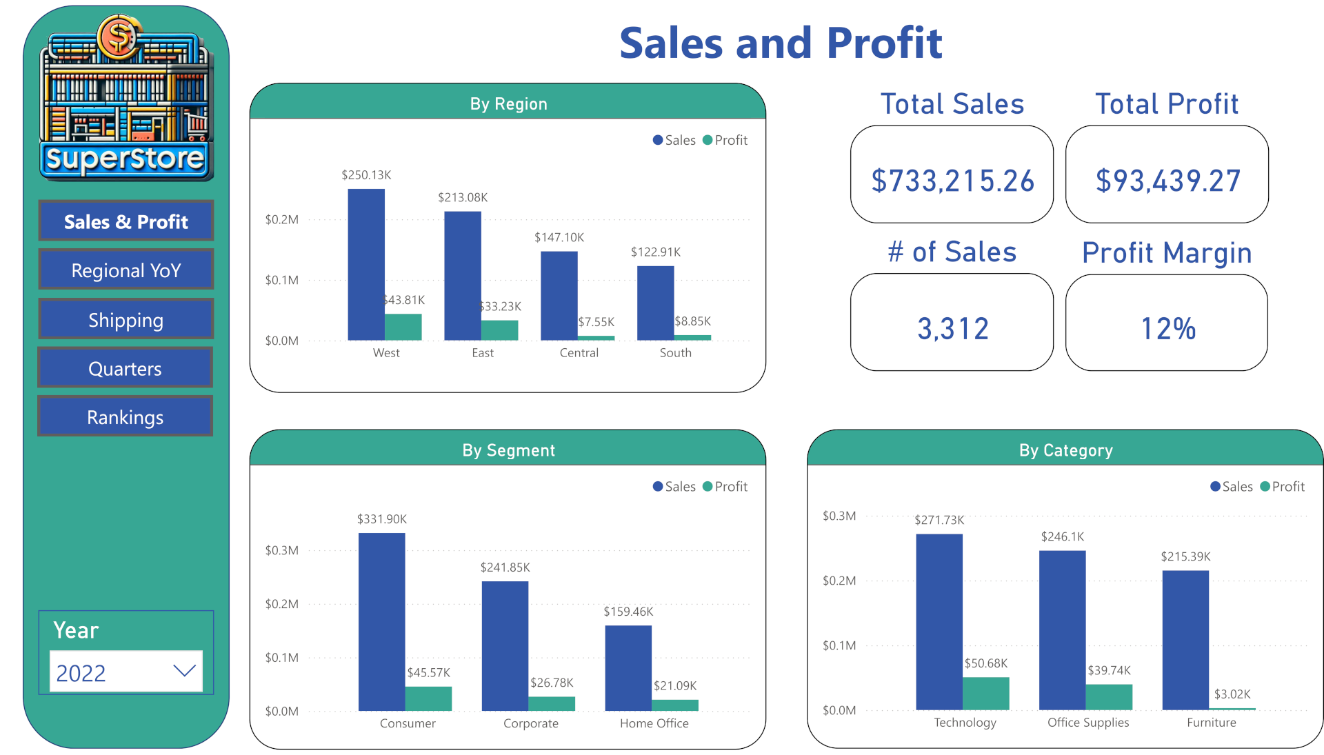
Naturally, you want the most important information on the first page of the dashboard. For a retail store, that means sales and profit. By default, company-wide numbers are displayed, but clicking on a particular region, you can see the numbers specific to that territory. Likewise, clicking on a Segment or Category will break things down accordingly. You can also select different years to see previous outcomes.
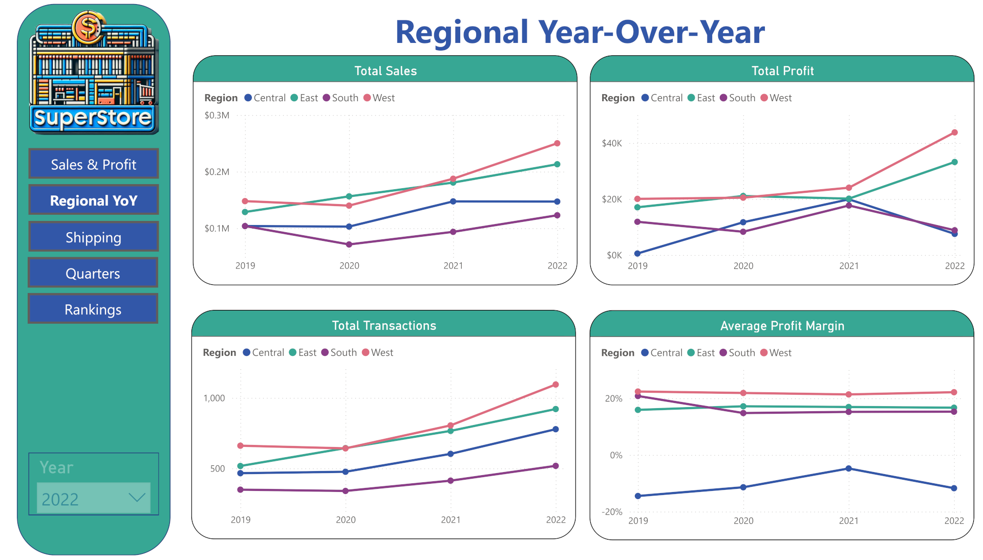
The second page shows a year-over-year comparison of various KPIs across regions. As the visuals range across years, the year dropdown is disabled to prevent any confusion. (Looking at it now, if this was a production dashboard I would probably move the Quarters page ahead of this section, depending on the needs of the stakeholders.)
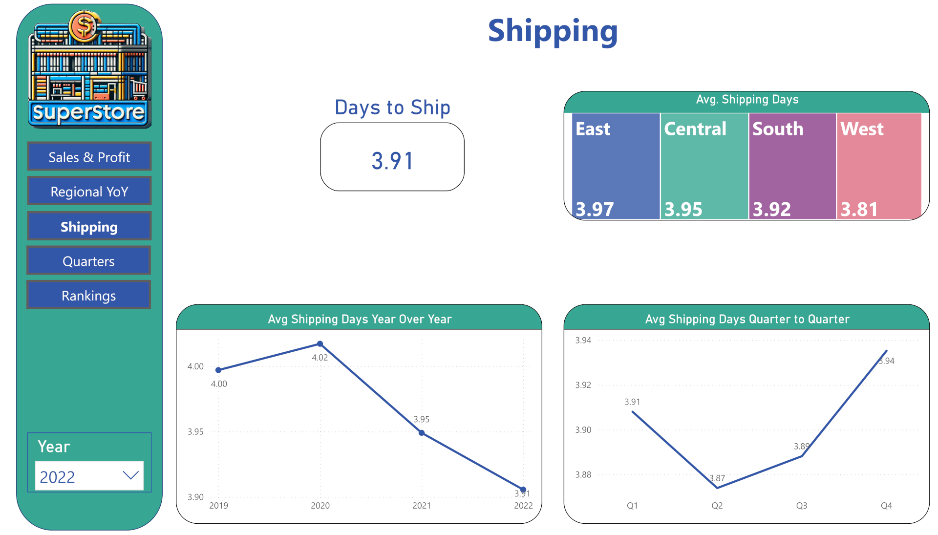
I thought it would be interesting to look at shipping patterns. In a production dashboard, there would probably be a target set with an indication of progress made in relation to that goal. One clear direction for data analysis would be to investigate why the shipping time increased sharply in the fourth quarter. This isn't consistent from year to year, so it isn't a matter of the typical holiday rush. Nor does it seem to correlate with transaction counts. If I do an actual analysis of this dataset, I'll dig into it.
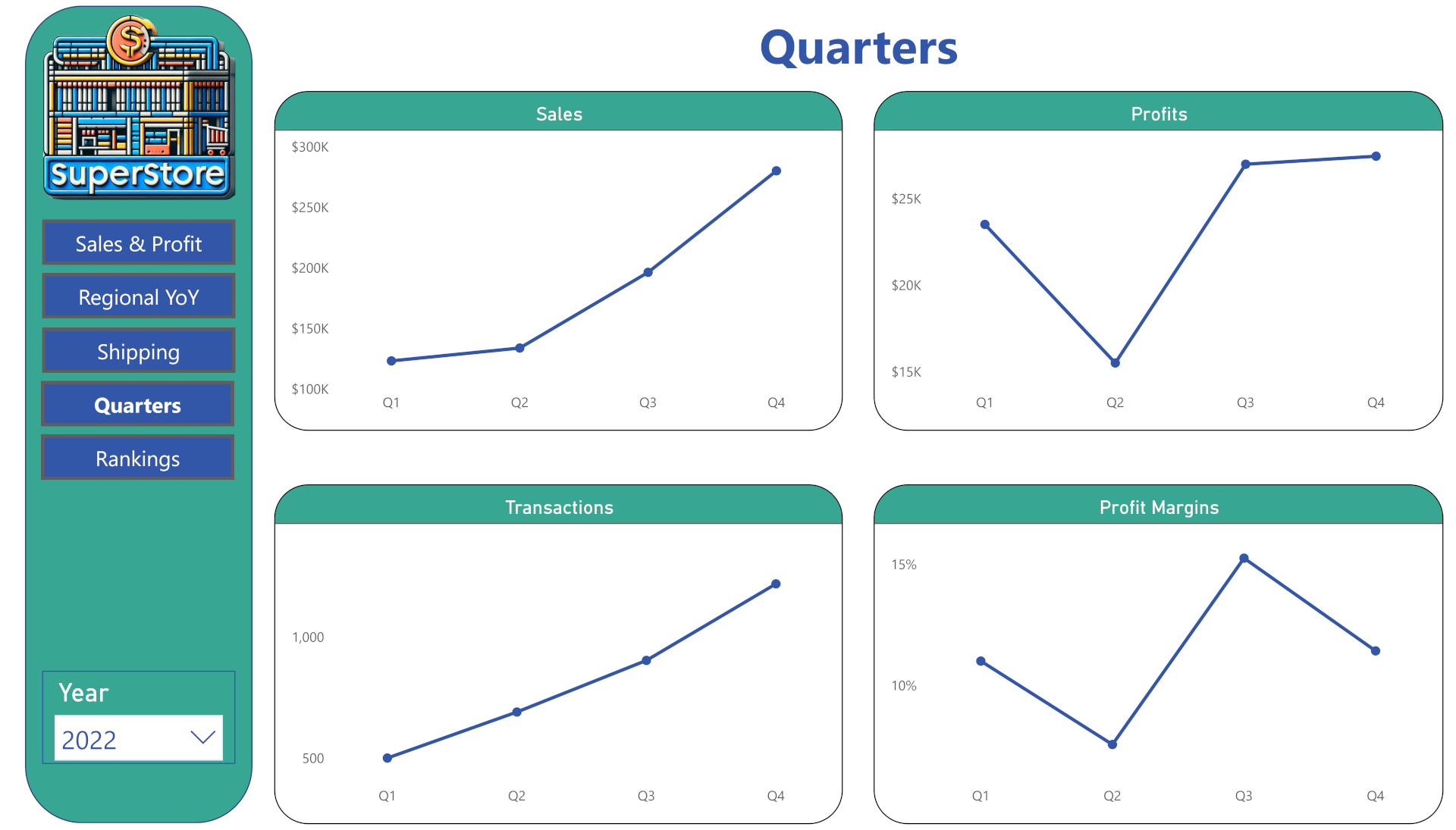
This would be one of the most-used pages for people focused on the current state of the company. This information would allow stakeholders to investigate immediate issues, such as why profits plummeted in the second quarter despite a slight increase in sales. You can view previous years for the sake of comparison, but this page would primarily be used to assess fresh information as it comes in.
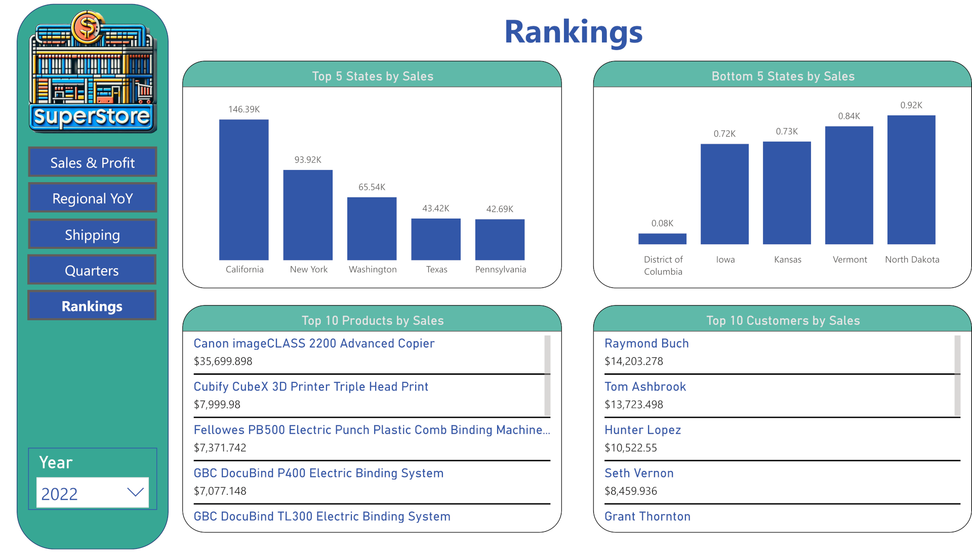
This is a sampling of rankings that can be displayed. The top and bottom states ranked by sales may not be particularly useful in this instance, as it closely correlates with population, but it shows that visual rankings are an option. The lists of top selling products and top purchasing customers were created by first creating a calculated column to rank all of the items:
Customer Rank =
RANKX(
	ALL('superstore_dataset'[customer]),
	CALCULATE(
		SUM('superstore_dataset'[sales])), , DESC, DENSE)
and then creating a measure that pulled in all customers with a rank of 10 or higher:
Top Customers =
IF(
    [Customer Rank] <= 10,
    SUM('superstore_dataset'[Sales]),
    BLANK()
)
Next, I placed the 'customer' field and the 'Top Customer' measure in a multi-line card to display the list. The measures could be used in a variety of visuals, but I found this format best for clear reading and easy scrolling.
There are other metrics that could be displayed, but this should be sufficient to demonstrate my ability to assemble visually appealing and informative dashboards in Power BI. If this were a continuously updated data set, there would be additional pages to display up-to-the-minute information so that stakeholders could make necessary adjustments. If a Power BI dashboard is what you require, I can deliver.