Conducted By: Samuel Kempf
Last Updated: 27-November-2023
Conducted By: Samuel Kempf
Last Updated: 27-November-2023
This case study is the capstone project for the Google Data Analytics certification program. In it, I analyze ride data from a bike-share company to identify differences between subscribing "members" and "casual" users who pay per ride, using Excel, BigQuery, and RStudio. I will be following Google's six step data analysis cycle as outlined below.
You can find additional information about this case study in the following locations:
Cyclistic is a bike-share company headquartered in Chicago. The company serves two kinds of users, annual subscribers ("members") and people who pay each time they use a bike ("casuals"). The director of marketing believes the company's future success depends on maximizing the number of annual memberships. Therefore, the analytics team has been tasked with understanding how casual riders and annual members use Cyclistic bikes differently. These insights will be used to design a new marketing strategy geared toward converting casual users into subscribing members.
There are three questions that will guide the future of the marketing program:
Analyze historical data to uncover trends that explain differences in how subscribing members and casual riders use Cyclistic bikes.
While Cyclistic is a fictional company created for this case study, we will be using data sets provided by Divvy to conduct our analysis. This data has been made available by Lyft Bikes and Scooters, LLC under the following license agreement.
While Divvy provides data dating back to 2004 and is currently updated monthly, I elected to use the data from January to December of 2022, so as to get a full view of an entire calendar year. The data comes in the form of 12 CSV files, as show below:
In total, these 12 files are 1GB in size, uncompressed.
This is structured data, consisting of more than 5.6 million records of 13 fields each. The columns consist of the following fields:
|
|
This data meets the ROCCC standard introduced in the Google Data Analytics certification program.
While this data is comprehensive, it has been anonymized so as to protect the identity of users. As such, we are not able to identify how many of the rides are conducted by the same person. Were this not the case, we could produce a further level of analysis which is not possible under the current conditions.
The data was now ready to be analyzed. Since I was dealing with 5,667,617 total rows, I chose to upload the data to BigQuery to use Structured Query Language in my analysis.
The CSV files ranged from 15.5MB - 149MB, so I elected to first upload the files to a Google Cloud Storage bucket and then import them into BigQuery. I created 12 tables using the abbreviated month names as the table names. The first few files imported without issue, however BigQuery soon ran into an issue converting some of the 'ride_length' fields into a DATETIME format.
Upon investigating, I discovered that several months had entries where 'end_ride' occurred earlier than 'start_ride', resulting in a negative 'ride_length' value. In total, 8 out of 12 months had erroneous entries of this type. Most of them ranged from one such entry to sixteen. The outlier was November, which contained forty-one invalid times. However, as November consisted of 337,735 rows, 41 entries is so neglible that excluding them would have no noticeable effect on the analysis. So I deleted the erroneous entries from all 8 months and was then able to successfully import them into BigQuery.
While exploratory analysis is always an important aspect of data analytics, it is especially crucial for a question like "What are the differences between annual subscribers and casual riders?". (Note: The visualizations were not produced until the share phase, as detailed below, but are included in this section to illustrate the findings.)
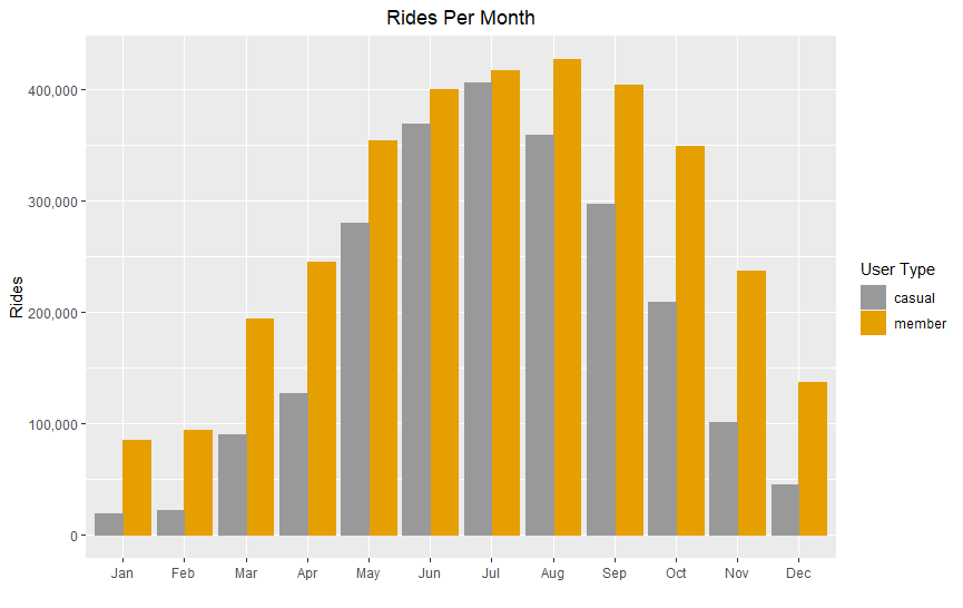
The first aspect I investigated was how many total rides each group took per month. Not surprisingly, subscribers took more total rides in all 12 months. Also, as may be expected, both groups took more rides in the warmer months. Members ranged from 85,250 rides in January to a peak of 427,000 rides in August. Casual users took only 18,520 rides in January but peaked at 406,046 in July.
As noted, members took more rides in all 12 months, but the share of total rides differed drastically between the warm and cold months. In January, casual riders accounted for only 17.85% of total rides. However, in June the share was almost equal, with casual riders accounting for 49.31% of total rides. This initial exploration suggests that it would be sensible for any campaigns targeted at casual riders to run in the warmer months when they are more inclined to make use of the service.
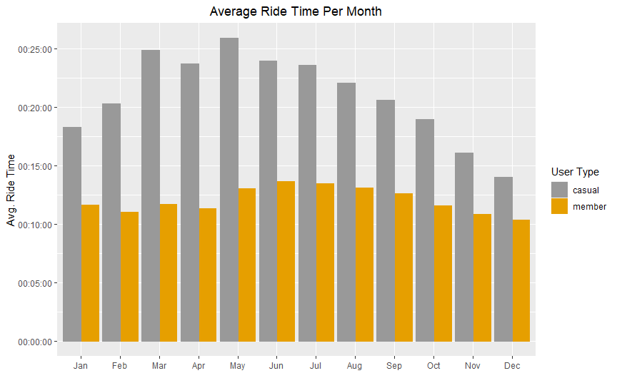
Next, I decided to investigate average ride time. It turns out that while subscribers take far more rides than casuals, the casual users spend far more time on their rides. Subscribers averaged 12m24s per ride, while casuals averaged 22m21s. The max monthly member average was 13m39s in June, while the lowest casual monthly average was 14m01s in November. This suggests a possible point of focus for a conversion campaign might be the amount of time casual riders spend on their rides.
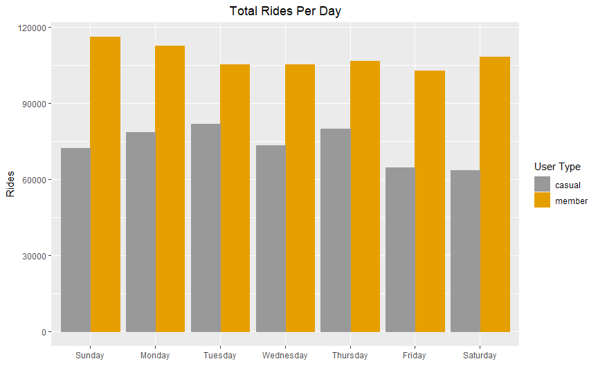
Having looked at monthly statistics, I next turned my attention to daily figures. Perhaps swayed by the category names, my initial supposition was that casual riders would be more active on weekends, whereas subscribers would ride primarily on weekdays. However, the data quickly disproved this hypothesis. Surpisingly, members were most active on Sunday, followed by Monday and Saturday. Members rode less on Friday than any other day. Meanwhile, casual riders were most active on Tuesdays and Thursdays, whereas Saturday and Sunday were two of the bottom three, along with Friday.
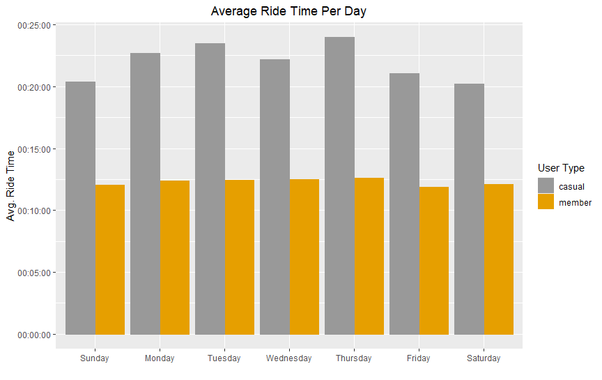
So total rides per day of the week didn't pan out the way I expected, but what about the average time spent on rides each day? Most people have more free time on weekends, right? Maybe so, but they don't spend that time on bike rides. Saturday and Sunday were the only two days that casual riders averaged less than 21 minutes per ride. Weekends fell near the bottom for members as well, though Fridays averaged the shortest rides. Just like with total number of rides, casual riders took their longest rides on Tuesdays and Thursdays. Those days were also at the top for subscribers, albeit with Wednesday sandwiched between them.
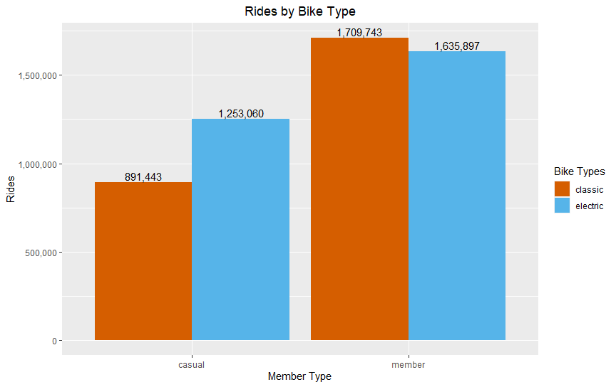
Cyclistic offers two types of bikes, traditional and electric. I was curious to see which model each user group preferred. Subscribers show a slight preference for traditional bicycles at 51%. Casual riders, however, demonstrate a moderate preference for electric bikes at 58%.
Having completed the analysis, it is now time to share the findings with stakeholders. To facilitate this process, I generated several visualizations in R, as seen above. The process I used to do this can be seen in this R knit file
Once the visualizations were complete, I put together a presentation in Canva to convey my findings to stakeholders.
As this is a case study, there is no action to be taken. Were this a real scenario, my hope is that my suggestions would prove useful in creating a marketing campaign.